Overview
For this small challenge, I wanted to work on Lezhin's section for exclusively licensed webcomics under "Lezhin Only". I sought to improve clarity and navigation to expand and browse more exclusive comics.
Task
Rewrite copy to clarify its exclusive section and streamline navigation to browse a curated list of comics solely available on Lezhin through genre and other filters.
Pain Points
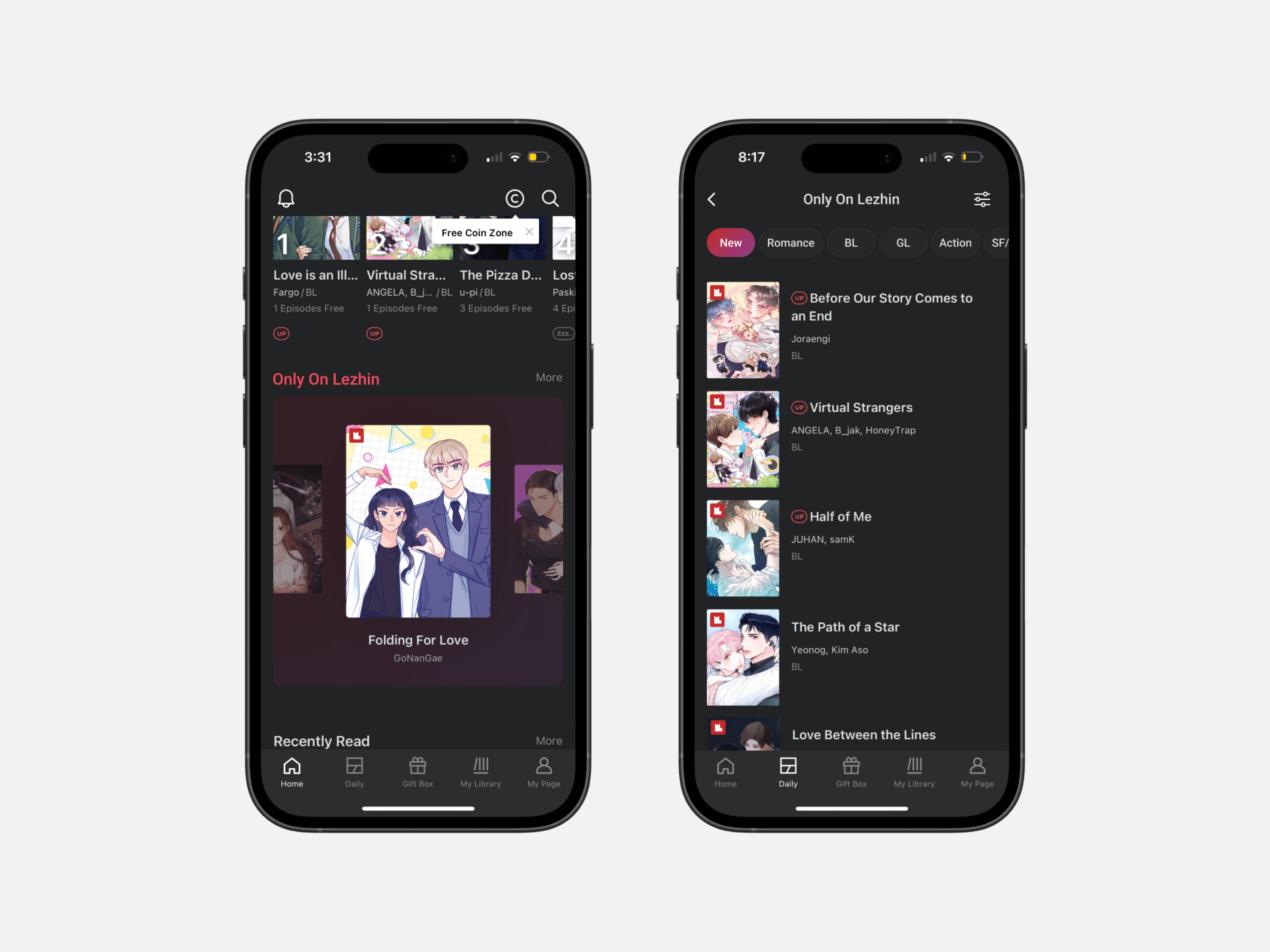
The original section on the app lacked clear copy and when tapping on "More" to view other exclusive titles I was met with the "Daily" tab where comics are sorted through different days of updates and ranking but also contain comics that are licensed on various platforms.

Lack of clarity within the Lezhin app poses two issues for users:
Ambiguous navigation: The "More" button lacked specificity, leading users to unrelated sections of the app for that specific action.
Poor portrayal of Lezhin's catalog: There is no true highlight of the exclusivity and value of app-only titles effectively.
Strategy
In my redesign, I focused on streamlining navigation and enhancing clarity.
Improved Copy: The text was updated to “Only on Lezhin” to set clear expectations for users.
Streamlined navigation: When users press "More" they are led to a new page where exclusive comics are curated.
Filter and Sorting Options: Users could sort app-only exclusives by genre and more filters for a tailored browsing experience.
Redesign