Overview
In this redesign project, I focused on improving the usability and effectiveness of a subscription upgrade pop-up for Swooped, a job search platform that offers tools to optimize resumes, cover letters, and more through AI. The goal was to make the messaging clearer, enhance visual hierarchy, and drive more users to upgrade their subscriptions.
Task
Redesign the subscription upgrade pop-up to improve information hierarchy, simplify the decision-making process of subscribing for users by offering clarity, and portray cohesive brand messaging.
Pain Points
I was graced with a prompt to upgrade my subscription during my time using Swooped. Despite reading the benefits that came with Swooped Pro, as a user, I wasn't motivated to do so because I was unsure of how my experience would change from the free version. I was kind of being left in the dark in terms of the perks and limitations of a free plan:
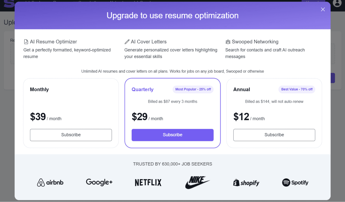
The pop-up also lacked a clear textual hierarchy made it further difficult to understand the value of upgrading and lacked a positive and encouraging call to action despite its clear direction.
Strategy
I approached the redesign with a focus on clarity, hierarchy, and user motivation:
Streamlined messaging: Simplified the copy to focus on the most impactful benefits, such as unlimited resume optimizations, AI cover letters, and more.
Enhanced Visual Hierarchy: Highlighted the primary benefit with bold text and an icon for instant recognition and organized content into digestible sections using bullet points and headings when users toggle which plan they would like to learn more about.
Encouraged users: Including a CTA that was concise but also offered reassurance to users.
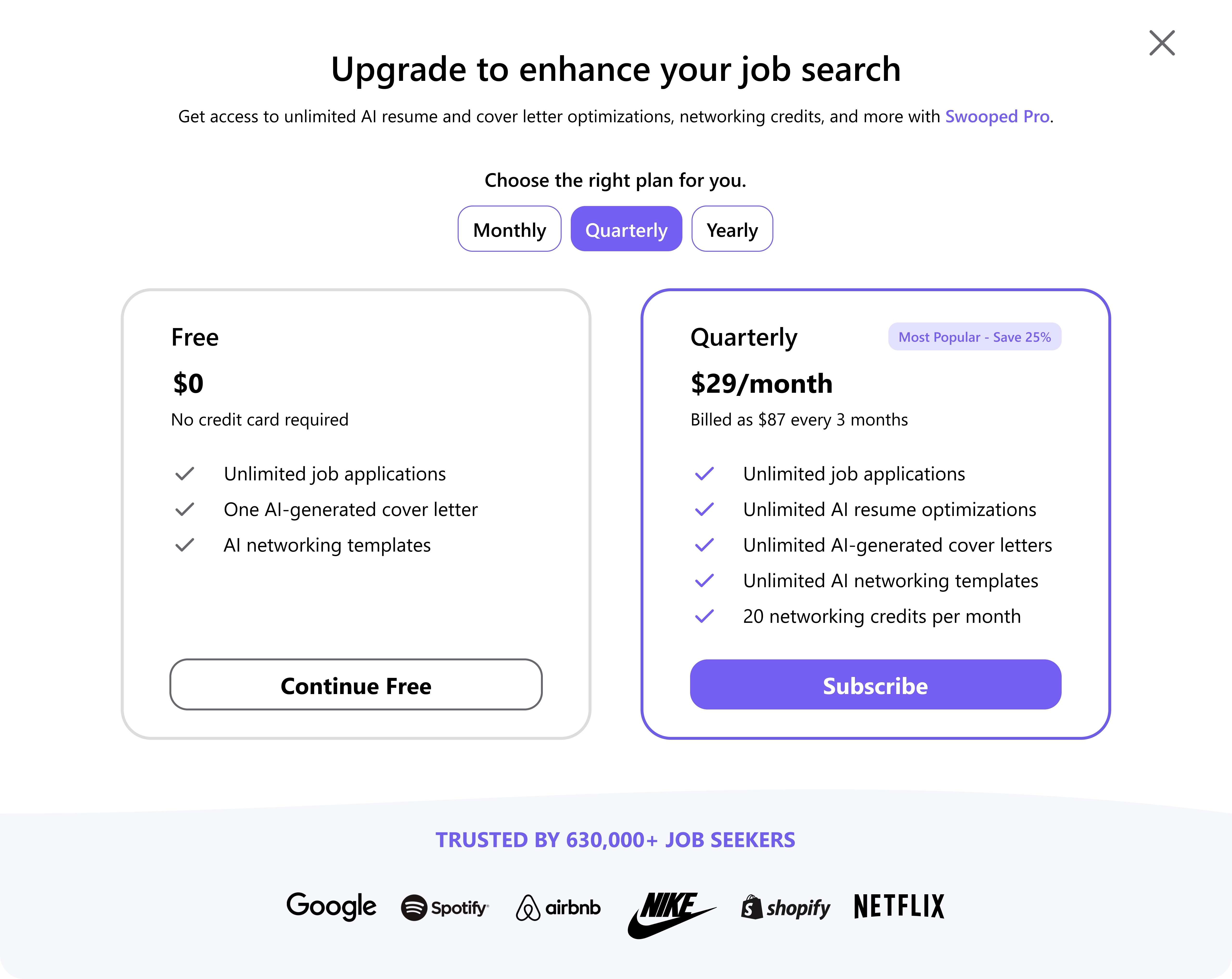
Redesign
The redesigned pop-up created a smoother upgrade experience by:
Increasing clarity and readability, helping users quickly understand the value of upgrading by offering a comparison of free and Swooped Pro plans.
Improving conversions by making the CTA more prominent and appealing in alignment with Swooped branding such as the color palette and font.