Overview
During this challenge, I worked on MOIDA's modal popup, which is targeted at new website visitors and intended to gather recommendations for beauty or skin concerns. MOIDA is a Korean beauty and skincare retailer.
Task
Address usability challenges and add context to the popup copy to enhance the user experience of MOIDA’s modal window. This window collects user preferences based on concern or reason for personalized product recommendations.
Pain Points
The original popup was intrusive, containing grammar mistakes within the UX copy. Options for any user action also lacked context, leaving users unclear on any inputs that would change their experience or lead them next. With only five options to choose from, user personalization is limited.
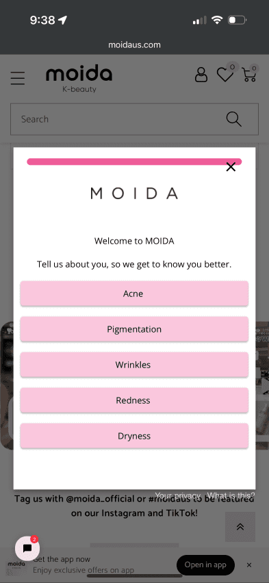
Strategy
Simplify messaging: Clear, concise text is more engaging with copy such as "Works for you" which sets expectations for users to personalize their experience through preferences or concerns.
Stronger CTA: A single “Get Started” button encourages engagement without forcing users to make immediate decisions or being presented with choices that lack context and inclusivity of skin issues, types, or preferences.
Redesigns